Exercises#
Now we turn to exercises. It is important that you complete them before continuing, since they present new concepts we will need.
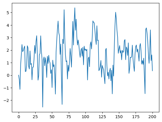
Exercise 1#
Your first task is to simulate and plot the correlated time series
The sequence of shocks \(\{\epsilon_t\}\) is assumed to be IID and standard normal.
In your solution, restrict your import statements to
import numpy as np
import matplotlib.pyplot as plt
Solution:#
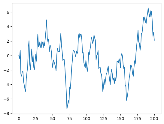
α = 0.9
T = 200
x = np.empty(T+1)
x[0] = 0

for t in range(T):
    x[t+1] = α * x[t] + np.random.randn()

plt.plot(x)
plt.show()
Exercise 2#
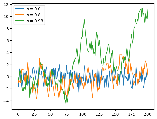
Starting with your solution to exercise 1, plot three simulated time series, one for each of the cases \(\alpha=0\), \(\alpha=0.8\) and \(\alpha=0.98\).
Use a for loop to step through the \(\alpha\) values.
If you can, add a legend, to help distinguish between the three time series.
Hints:
If you call the
plot()function multiple times before callingshow(), all of the lines you produce will end up on the same figure.For the legend, noted that the expression
'foo' + str(42)evaluates to'foo42'.
Solution:#
α_values = [0.0, 0.8, 0.98]
T = 200
x = np.empty(T+1)

for α in α_values:
    x[0] = 0
    for t in range(T):
        x[t+1] = α * x[t] + np.random.randn()
    plt.plot(x, label=f'$\\alpha = {α}$')

plt.legend()
plt.show()
Exercise 3#
Similar to the previous exercises, plot the time series
Use \(T=200\), \(\alpha = 0.9\) and \(\{\epsilon_t\}\) as before.
Search online for a function that can be used to compute the absolute value \(|x_t|\).
Solution:#
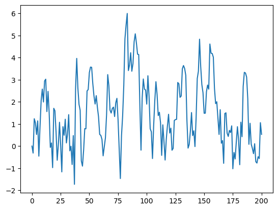
α = 0.9
T = 200
x = np.empty(T+1)
x[0] = 0

for t in range(T):
    x[t+1] = α * np.abs(x[t]) + np.random.randn()

plt.plot(x)
plt.show()
Exercise 4#
One important aspect of essentially all programming languages is branching and conditions.
In Python, conditions are usually implemented with if–else syntax.
Here’s an example, that prints -1 for each negative number in an array and 1 for each nonnegative number
numbers = [-9, 2.3, -11, 0]
for x in numbers:
    if x < 0:
        print(-1)
    else:
        print(1)
-1
1
-1
1
Now, write a new solution to Exercise 3 that does not use an existing function to compute the absolute value.
Replace this existing function with an if–else condition.
Solution:#
# Set a seed
#seed_value = 42
#np.random.seed(seed_value)


α = 0.9
T = 200
x = np.empty(T+1)
x[0] = 0

for t in range(T):
    if x[t] < 0:
        abs_x = - x[t]
    else:
        abs_x = x[t]
    x[t+1] = α * abs_x + np.random.randn()

plt.plot(x)
plt.show()
Exercise 5#
Here’s a harder exercise, that takes some thought and planning.
The task is to compute an approximation to \(\pi\) using Monte Carlo.
Use no imports besides
import numpy as np
Your hints are as follows:
If \(U\) is a bivariate uniform random variable on the unit square \((0, 1)^2\), then the probability that \(U\) lies in a subset \(B\) of \((0,1)^2\) is equal to the area of \(B\).
If \(U_1,\ldots,U_n\) are IID copies of \(U\), then, as \(n\) gets large, the fraction that falls in \(B\), converges to the probability of landing in \(B\).
For a circle, \(area = \pi * radius^2\).
Solution:#
n = 10000

# Initialize the count of points inside the quarter circle
count = 0
for i in range(n):
    u, v = np.random.uniform(), np.random.uniform()
    # Check if the point is inside the quarter circle (x^2 + y^2 <= 1)
    if u**2 + v**2 <= 1:
        count += 1

area_estimate = count / n

print(area_estimate * 4)  # dividing by radius**2
3.1136
Exercise 6#
Python is a powerful tool to download and manage large amounts of data. To have an idea of its potential, let’s build a simple notebook that replicates a recent FRED blog post. Unlike previous exercises, here we need a third-party library so please start by opening anaconda prompt and run conda install pip. You should then be able to run directly in your notebook:
#!conda install pip
#!pip install fredapi
Solution:#
import pandas as pd
import matplotlib.pyplot as plt
from fredapi import Fred
fred = Fred(api_key='insert your api key here')
seriesid = ['FRBATLWGT12MMUMHGO',	'FRBATLWGT12MMUMHWGILH']
data = pd.DataFrame()
for j in range(0,len(seriesid)):
    data_j = fred.get_series(seriesid[j])
    data[seriesid[j]] = data_j


# Create a plot
fig, ax = plt.subplots()

# Plot the first line (dashed and red)
ax.plot(data.index, data['FRBATLWGT12MMUMHGO'], linestyle='--', color='red', label='Hourly wage growth')

# Plot the second line (solid and black)
ax.plot(data.index, data['FRBATLWGT12MMUMHWGILH'], linestyle='-', color='black', label='Hourly wage growth (Leisure & Hospitality)')

# Add labels and a legend
ax.set_xlabel('time')
ax.set_ylabel('pp.')
ax.set_title('Wage growth Leisure vs. Overall')
ax.legend()

# Show the plot
plt.show()
---------------------------------------------------------------------------
ModuleNotFoundError                       Traceback (most recent call last)
Cell In[11], line 3
      1 import pandas as pd
      2 import matplotlib.pyplot as plt
----> 3 from fredapi import Fred
      4 fred = Fred(api_key='insert your api key here')
      5 seriesid = ['FRBATLWGT12MMUMHGO',	'FRBATLWGT12MMUMHWGILH']

ModuleNotFoundError: No module named 'fredapi'
Exercise 7#
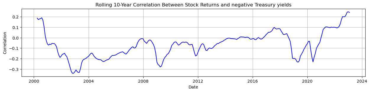
The correlation between bonds and stocks is an important parameter for asset allocation decisions. Since most long-term investor portfolios involve a mix between bonds and stocks, this parameter is of paramount importance. A recent issue under discussion by academics and practitioners relates to the change in sign of this parameter. Read about the discussion in this paper and replicate Exhibit 1 on page 2. Use the data from FRED for equity SPASTT01USM657N and bonds DGS10.
Solution:#
import pandas as pd
import matplotlib.pyplot as plt
from fredapi import Fred
fred = Fred(api_key='insert your api key here')
seriesid = ['WILL5000IND',	'DGS10']
data = pd.DataFrame()
for j in range(0,len(seriesid)):
    data_j = fred.get_series(seriesid[j],'01/01/1990', '01/09/2023')
    data_j = data_j.resample('M').mean()
    info = fred.get_series_info(seriesid[j])
    print('description of >> '+ seriesid[j] + " : " + info['title'])
    data[seriesid[j]] = data_j
description of >> WILL5000IND : Wilshire 5000 Total Market Index
description of >> DGS10 : Market Yield on U.S. Treasury Securities at 10-Year Constant Maturity, Quoted on an Investment Basis
# Now inspect the data
rw_size = 120
rolling_correlation = data['WILL5000IND_r'].rolling(window=rw_size).corr(-data['DGS10'])
rolling_correlation = rolling_correlation.dropna()

plt.figure(figsize=(15, 3))
plt.plot(rolling_correlation, label='Rolling 10-Year Correlation', color='blue')

# Add labels and a legend
plt.xlabel('Date')
plt.ylabel('Correlation')
plt.title('Rolling 10-Year Correlation Between Stock Returns and negative 10 yr Treasury yields')

plt.grid(True)
plt.show()